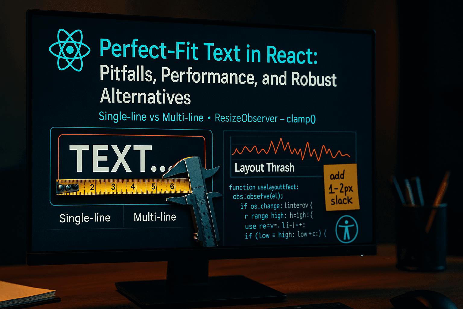
Perfect-Fit Text in React: Pitfalls, Performance, and Robust Alternatives
Fitting text exactly into a box looks simple, but it's a real performance and product trap. This article builds on the ideas in Sentry's post and goes deeper into the trade-offs, performance pitfalls, and a robust alternative you can drop into React apps.
Measuring … causes a reflow which can be catastrophically bad.
— Sentry EngineeringPremature optimization is the root of all evil.— Donald Knuth
Why "perfect fit" is deceptively hard
Two constraints (width and height) must be satisfied across variable fonts, wrapping, and reflow cost.
Measuring text usually means triggering layout (e.g., getBoundingClientRect, offsetWidth). That can be expensive if repeated or done in tight loops. Even with ResizeObserver, naïve code can thrash the layout pipeline and create flicker/jank.
Taxonomy: core issues & trade-offs
- Performance / Layout Thrashing: Forced reflow is costly; repeated measurement on resize leads to jank.
- Convergence & edge cases: Binary search can oscillate if your "fits?" predicate flips on rounding edges. Always cap iterations and define fallbacks.
- Dual constraints: Fitting to height may break width and vice-versa; glyph widths vary.
- Font rendering & legibility: Avoid
transform: scale()/SVG scaling for text; kerning/hinting suffers. - Accessibility: Keep text real and selectable; avoid
<canvas>text for UI copy. - Flicker during load/resize: Intermediate font sizes may flash. Hide until settled or block initial paint for specific widgets.
- API complexity: Managing min/max bounds, slack pixels, rounding, and early-outs adds maintenance cost.
- Responsiveness & dynamic content: Multi-line fitting is much harder than single-line and often not worth "pixel-perfect" pursuit in general-purpose UI.
When not to chase perfect fit
If the UI tolerates small deviations, prefer fluid typography over complex JavaScript solutions.
/* Example: fluid but bounded — fast, no JS */
h1 {
  font-size: clamp(1.125rem, 2.5vw + 0.5rem, 2.5rem);
}
Combine with text-overflow: ellipsis, line-clamp, or responsive breakpoints.
Save algorithmic fitting for hero numbers, scoreboards, badges, or tight cards where space is fixed and content length is predictable.
Approaches compared (table)
| Approach | How it works | Pros | Cons | Best for |
| --- | --- | --- | --- | --- |
| CSS fluid (clamp, vw) | Scale font by viewport/container heuristics | Simple, fast, zero JS | Not exact; ignores actual glyph widths | Marketing headers, general UI |
| Binary search w/ measurement | Adjust font-size, measure, repeat | Deterministic, "good enough" | Reflow cost; needs caps & slack | Single-line numbers/labels |
| Transform/SVG scale | Render once, scale box | No reflow loop | Blurry text, poor a11y | Decorative, non-UI text |
| Canvas raster text | Draw text to <canvas> | Pixel control | Not selectable, a11y loss | Charts/rendered art |
| Server pre-measure | Precompute fits per string | Instant client perf | Inflexible, i18n hard | Fixed catalogs, signage |
| Container Queries only | CSS reacts to container size | Zero JS | Still not glyph-accurate | Tiered sizes, not "perfect" |
A robust React design
A production-ready text fitting solution requires careful attention to performance, edge cases, and user experience.
Core Principles:
- Measure sparingly: React only when container or content actually changes
(
ResizeObserver, content hash). - Cap iterations: Hard cap (~12–20), then fallback.
- Add slack: Leave 1–2px "breathing room" to avoid flip-flop at rounding edges.
- Hide until settled: Prevent flicker on first paint (for widgets, not whole pages).
- Width-first for multi-line: Width usually binds earlier; only shrink when overflow is true.
- Prefer DOM measurement: The browser's layout engine is the source of truth for line breaks.
Single-line fitter (binary search + bounds)
// useAutoFitSingleLine.ts
import { useEffect, useLayoutEffect, useRef, useState } from 'react';

type Options = {
  min: number; // px
  max: number; // px
  stepCap?: number; // max iterations
  slackPx?: number; // leave some space to avoid flip-flop
  blockInitialPaint?: boolean;
  debounceMs?: number; // resize debounce
};

export function useAutoFitSingleLine(opts: Options = { min: 8, max: 72 }) {
  const { min, max, stepCap = 16, slackPx = 1, blockInitialPaint = true, debounceMs = 60 } = opts;

  const ref = useRef<HTMLDivElement | null>(null);
  const [fontSize, setFontSize] = useState<number>(max);
  const [ready, setReady] = useState<boolean>(!blockInitialPaint);
  const rafId = useRef<number | null>(null);
  const tmId = useRef<number | null>(null);

  // ResizeObserver: triggers only when the container actually changes
  useLayoutEffect(() => {
    if (!ref.current) return;
    const el = ref.current;
    let stop = false;

    const debounce = () => {
      if (tmId.current) window.clearTimeout(tmId.current);
      tmId.current = window.setTimeout(run, debounceMs);
    };

    const ro = new ResizeObserver(debounce);
    ro.observe(el);

    // run once after mount
    run();

    function run() {
      if (!el || stop) return;
      // binary search over font-size
      let lo = min,
        hi = max;
      let lastGood = min;
      let steps = 0;

      const fits = (size: number) => {
        el.style.fontSize = `${size}px`;
        // Force reflow only once per check by reading relevant props
        // Overflow check with slack
        const wOk = el.scrollWidth <= el.clientWidth + slackPx;
        const hOk = el.scrollHeight <= el.clientHeight + slackPx;
        return wOk && hOk;
      };

      while (lo <= hi && steps < stepCap) {
        const mid = Math.floor((lo + hi) / 2);
        if (fits(mid)) {
          lastGood = mid;
          lo = mid + 1; // try larger
        } else {
          hi = mid - 1; // too large
        }
        steps++;
      }

      // Finalize with last known good
      el.style.fontSize = `${lastGood}px`;
      setFontSize(lastGood);
      setReady(true);
    }

    return () => {
      stop = true;
      ro.disconnect();
      if (rafId.current) cancelAnimationFrame(rafId.current);
      if (tmId.current) window.clearTimeout(tmId.current);
    };
  }, [min, max, stepCap, slackPx, debounceMs, blockInitialPaint]);

  return { ref, fontSize, ready };
}
Usage:
// SingleLineStat.tsx
import React from 'react';
import { useAutoFitSingleLine } from './useAutoFitSingleLine';

export const SingleLineStat: React.FC<{
  value: string | number;
  min?: number;
  max?: number;
}> = ({ value, min = 10, max = 120 }) => {
  const { ref, ready } = useAutoFitSingleLine({ min, max, blockInitialPaint: true });

  return (
    <div
      ref={ref}
      aria-label={`stat ${value}`}
      style={{
        // Constrain box; single line with ellipsis as last resort
        width: '100%',
        height: 80,
        lineHeight: 1.1,
        whiteSpace: 'nowrap',
        overflow: 'hidden',
        textOverflow: 'ellipsis',
        visibility: ready ? 'visible' : 'hidden',
      }}
    >
      {value}
    </div>
  );
};
Why this works: We only measure on container changes; we search a narrow range with a cap and slack to avoid oscillation. We also hide until settled to prevent flicker on mount.
Multi-line fitter (measure element, width-first)
Multi-line adds line breaks and height growth. Strategy: start from a reasonable size, shrink while overflow is true, and cap iterations.
Use width-first checks because width is often the first constraint to fail.
// useAutoFitMultiline.ts
import { useEffect, useLayoutEffect, useRef, useState } from 'react';

type MultiOpts = {
  min: number;
  max: number;
  stepCap?: number;
  slackPx?: number;
  debounceMs?: number;
  blockInitialPaint?: boolean;
};

export function useAutoFitMultiline(opts: MultiOpts = { min: 10, max: 28 }) {
  const { min, max, stepCap = 18, slackPx = 1, debounceMs = 80, blockInitialPaint = true } = opts;

  const ref = useRef<HTMLDivElement | null>(null);
  const [ready, setReady] = useState<boolean>(!blockInitialPaint);

  useLayoutEffect(() => {
    const el = ref.current;
    if (!el) return;

    const run = () => {
      if (!el) return;
      let size = Math.min(max, Math.max(min, max));
      let steps = 0;

      // Start from max and shrink until it fits or we hit caps
      while (steps < stepCap) {
        el.style.fontSize = `${size}px`;
        const widthOverflow = el.scrollWidth > el.clientWidth + slackPx;
        const heightOverflow = el.scrollHeight > el.clientHeight + slackPx;

        if (!widthOverflow && !heightOverflow) break;

        size -= 1; // simple linear decrease is stable for multiline
        if (size <= min) {
          size = min;
          break;
        }
        steps++;
      }

      el.style.fontSize = `${size}px`;
      setReady(true);
    };

    let tm: number | undefined;
    const debounce = () => {
      if (tm) window.clearTimeout(tm);
      tm = window.setTimeout(run, debounceMs) as unknown as number;
    };

    const ro = new ResizeObserver(debounce);
    ro.observe(el);
    run();

    return () => {
      ro.disconnect();
      if (tm) window.clearTimeout(tm);
    };
  }, [min, max, stepCap, slackPx, debounceMs, blockInitialPaint]);

  return { ref, ready };
}
Usage:
// MultiLineParagraph.tsx
import React from 'react';
import { useAutoFitMultiline } from './useAutoFitMultiline';

export const MultiLineParagraph: React.FC<{
  children: React.ReactNode;
  min?: number;
  max?: number;
  rows: number; // for height calculation
}> = ({ children, min = 12, max = 22, rows = 3 }) => {
  const { ref, ready } = useAutoFitMultiline({ min, max, blockInitialPaint: true });

  return (
    <div
      ref={ref}
      style={{
        width: '100%',
        // Constrain height by line count approximation
        lineHeight: 1.4,
        height: `calc(${rows} * 1.4em)`,
        overflow: 'hidden',
        display: 'block',
        visibility: ready ? 'visible' : 'hidden',
      }}
    >
      {children}
    </div>
  );
};
Multi-line uses a linear shrink loop (stable, fewer oscillation pitfalls). We keep it simple and bounded; if you need higher precision, you can hybridize: binary search until within ~4px, then linear to settle.
Performance techniques
Optimizing text fitting requires careful attention to browser reflow, rendering cycles, and measurement strategies.
- Debounce/throttle resize handling.
- Iteration caps + fallback sizes.
- Slack pixels to prevent flip-flop from rounding.
- Content hashing: if the string didn't change, avoid recomputing on mere container nudges.
- Avoid measuring unrelated DOM: measure only the target element.
- Prefer
useLayoutEffectfor initial fit (so size is settled pre-paint for the widget), thenuseEffectfor non-critical updates. - For complex pages, consider fitting off-screen (positioned or
visibility:hidden) before swapping in.
Useful references:
- MDN: Reflow and repaint • ResizeObserver • scrollWidth / clientWidth
- CSSWG: CSS Values & Units —
em,ex,cap,ic
Accessibility notes
Accessible text fitting ensures that users can still read, select, and interact with content regardless of how it's sized.
- Keep text real: Use real DOM text (no canvas) for selection, AT announcement, and translation.
- Avoid churn: Re-fit on container changes, not keystrokes—prevent constant size changes on focused elements.
- Maintain contrast: Tiny fonts hurt readability — set a
minthat respects WCAG legibility standards.
Testing & diagnostics
Comprehensive testing ensures your text fitting solution handles edge cases, performs well, and works across devices and languages.
- Unit tests: Predicate stability (fit/no-fit) around thresholds; ensure iteration caps stop loops.
- E2E tests: Viewport resizes, device emulation (low-end CPU), large/long strings, i18n (CJK, RTL).
- Performance tests: Record layout & style recalc time in DevTools Performance; ensure no runaway loops.
- Visual tests: Snapshot with representative strings; check for ellipsis fallback when necessary.
Use cases & recommendations
Choose the right tool for the job: not every text element needs JavaScript-powered fitting.
Great candidates:
- KPI tiles ("Big Number" displays)
- Price tags and product cards
- Badges and short labels
- Widgets with fixed area
Avoid algorithmic fitting for:
- Arbitrary multi-paragraph content
- Long dynamic copy
- User-editable fields
Rule of thumb: If exactness isn't required, choose CSS clamp() and call it a day. If exactness is required, constrain the problem (single-line, predictable content) and use a bounded, slack-aware fitter.
References
- Sentry Engineering — Perfectly Fitting Text to Container in React: https://sentry.engineering/blog/perfectly-fitting-text-to-container-in-react
- MDN — ResizeObserver: https://developer.mozilla.org/en-US/docs/Web/API/ResizeObserver
- MDN — Reflow: https://developer.mozilla.org/en-US/docs/Glossary/Reflow
- MDN — scrollWidth / clientWidth: https://developer.mozilla.org/en-US/docs/Web/API/Element/scrollWidth
- W3C CSS Values & Units Level 4: https://www.w3.org/TR/css-values-4/
Related GitHub & docs
- React docs — useLayoutEffect: https://react.dev/reference/react/useLayoutEffect
- Example lib for measuring elements (
react-use-measure): https://github.com/pmndrs/react-use-measure
Pros & cons of the presented approach
Pros
- Deterministic, bounded runtime
- Works with real DOM text (a11y-friendly)
- Handles single-line + constrained multi-line with minimal API
Cons
- Still incurs reflow; must be used selectively
- Multi-line precision is limited; favors stability over “perfection”
- Requires careful integration (debounce, caps, slack)
If you need a drop-in component
- Use
SingleLineStatfor one-liners (IDs, numbers, tags, chips). - Use
MultiLineParagraphfor short snippets where you want “best fit” but accept non-perfect results. - For everything else, prefer CSS fluid sizing + clamp, and design your layout to be forgiving, not “pixel-perfect.”
Summary
Auto-fitting text in React requires balancing performance, accessibility, and user experience. Use CSS solutions when possible, and reach for JavaScript only when pixel-perfect fitting is truly necessary.
The approaches covered in this article provide a solid foundation for handling both simple and complex text fitting scenarios. Remember: measure sparingly, cap iterations, add slack, and always prioritize accessibility.
SEO Keywords
- React text fitting
- ResizeObserver performance
- Binary search font size
- Auto-fit text React
- Multi-line text wrapping
- CSS clamp vs JavaScript
- React TypeScript examples
- Text scaling accessibility
- Performance optimization React
- Dynamic font sizing
