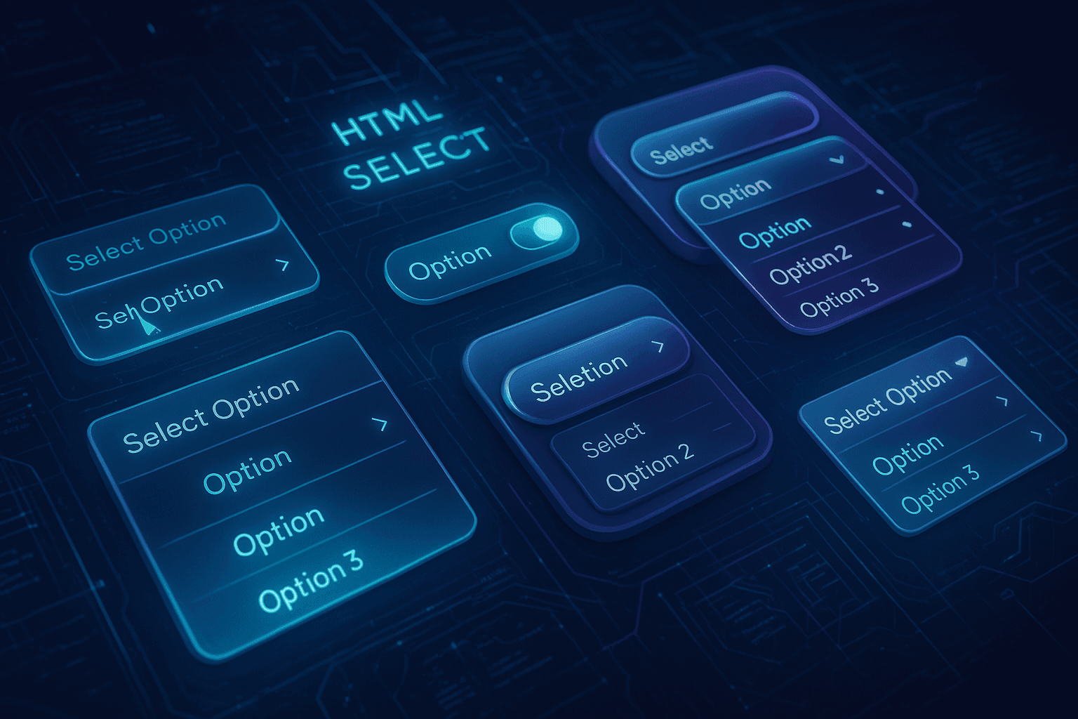
Styling Native <select> with :selectedcontent: A New Era for Custom Dropdowns
For decades, web developers struggled to style the <select> form element beyond the basics. The <select> dropdown's UI (the button, the list of options, the arrow indicator) has been largely off-limits to CSS, controlled instead by each operating system's native widgets.
This limitation meant developers often had to either live with the browser's default look or replace the <select> entirely with custom HTML/JS solutions mimicking a dropdown. These workarounds – from early jQuery UI widgets to modern React/Vue select components – provided more control but came with trade-offs: extra JavaScript, tricky accessibility, and performance overhead.
The good news is things are changing. A new standards-based solution is emerging that lets us heavily style a <select> using just CSS and a bit of additional HTML, while retaining native functionality. Chrome 135+ is the first to ship this capability, heralding a future where web designers and developers can finally unite on an accessible, fully CSS-styleable <select> element. This has been many years in the making, involving extensive engineering and cross-browser collaboration, and the result is a rich solution that still gracefully falls back in older browsers. In this article, we'll explore the star of this new API – the <selectedcontent> element (sometimes referred to as the :selectedcontent pseudo-element) – and show how it enables a modern, native approach to custom dropdowns.
What exactly is <selectedcontent>? It's a new HTML element (and effectively a pseudo-element of <select>) that displays the content of the currently selected <option> in the select's closed state. In other words, it represents the text/HTML that appears on the select's button face, mirroring whatever option is chosen. When the user's selection changes, the browser automatically updates the <selectedcontent> by cloning the newly selected option's DOM content into it. This allows developers to style that selected option's display independently from how options are styled in the dropdown list. As we'll see, this unlocks a ton of styling flexibility – for example, you could include icons or images in your <option> tags, but hide those icons in the <selectedcontent> so they only show in the dropdown, not on the collapsed button.
It's important to note up front that these features are experimental and not yet standardized.
In the rest of this article, we'll cover how to enable the new customizable select mode, the HTML/CSS syntax involved (including appearance: base-select and new pseudo-elements), and walk through building a custom-styled dropdown example. Then we'll discuss the pros and cons of this native CSS approach versus fully custom selects using JS and ARIA, complete with comparison tables and use-case recommendations.
We've been waiting decades for fully styleable selects without sacrificing accessibility. This feature finally delivers on that promise.
— Adam ArgyleThe Challenge with Native <select> Elements
Traditionally, styling a native <select> element was limited. Developers faced two main paths:
- Accepting minimal customization provided by the browser.
- Implementing entirely custom solutions using JavaScript and ARIA, often leading to performance overhead and accessibility issues.
The introduction of the :selectedcontent approach directly addresses these limitations.
Introducing the <selectedcontent> Element
The <selectedcontent> element is a new native HTML element designed to display the content of the currently selected <option> inside a <select>. It essentially mirrors the chosen option's HTML structure in the closed (collapsed) state of the dropdown menu.
Browser support:
Currently experimental and available in Chrome 135+. Other browsers (Safari, Firefox) do not yet support it, though the initiative is progressing within the Open UI Community Group.
Using appearance: base-select
To activate customizable styling on native selects, you must opt-in explicitly via CSS:
.custom-select,
.custom-select::picker(select) {
  appearance: base-select;
}
Applying appearance: base-select enables comprehensive CSS control over both the select button and dropdown list without sacrificing native behaviors such as keyboard navigation and screen reader compatibility.
Practical Example: A Custom Select Dropdown with HTML & CSS
Let’s build a straightforward fruit-selection dropdown:
HTML Markup:
<select name="fruit" class="custom-select">
  <button>
    <selectedcontent></selectedcontent>
    <svg class="arrow-icon" viewBox="0 0 24 24" aria-hidden="true">
      <path
        d="M6 9l6 6 6-6"
        fill="none"
        stroke="currentColor"
        stroke-width="2"
        stroke-linecap="round"
        stroke-linejoin="round"
      />
    </svg>
  </button>

  <option value="" selected disabled hidden>Select a fruit…</option>
  <option value="apple"><span class="icon">🍎</span> Apple</option>
  <option value="banana"><span class="icon">🍌</span> Banana</option>
  <option value="cherry"><span class="icon">🍒</span> Cherry</option>
</select>
CSS Styling:
Base select and button styles:
.custom-select,
.custom-select::picker(select) {
  appearance: base-select;
}

.custom-select {
  display: inline-flex;
  align-items: center;
  justify-content: space-between;
  padding: 0.5rem 0.75rem;
  width: 200px;
  font: 16px/1.4 sans-serif;
  color: #333;
  background: #fff;
  border: 1px solid #ccc;
  border-radius: 4px;
  cursor: pointer;
}

.custom-select::picker-icon {
  display: none;
}
Arrow and dropdown styling:
.custom-select .arrow-icon {
  width: 1em;
  height: 1em;
  transition: transform 0.2s;
}

.custom-select:open .arrow-icon {
  transform: rotate(-180deg);
}

.custom-select::picker(select) {
  background: #fff;
  border: 1px solid #ccc;
  border-radius: 4px;
  box-shadow: 0 4px 8px rgba(0, 0, 0, 0.1);
  max-height: 200px;
  overflow-y: auto;
}

.custom-select option {
  padding: 0.25rem 0.5rem;
}

.custom-select option:hover {
  background: #f0f0f0;
}

.custom-select option:checked {
  background: #e6f7ff;
}

.custom-select option:checked::checkmark {
  content: '✔';
  margin-right: 0.5em;
  color: #2196f3;
}

.custom-select selectedcontent .icon {
  display: none;
}
This setup produces a fully styled dropdown, complete with emoji icons and customized checkmarks, without a single line of JavaScript.
Native vs Fully Custom Selects: A Comparative View
| Aspect | Native Select (<selectedcontent>) | Custom Select (HTML + JS + ARIA) |
| --- | --- | --- |
| Usability | Native keyboard, forms, interactions | Custom scripting required |
| Accessibility | Excellent native support | Requires extensive ARIA handling |
| Styling | High flexibility, some constraints | Unlimited, fully customizable |
| Performance | Lightweight and fast | Potentially heavy with JS events |
| Maintenance | Easy, low overhead | More complexity, higher effort |
Recommendation:
Use native customizable selects whenever possible for standard dropdown requirements, due to their significant usability and accessibility advantages.
Progressive Enhancement & Compatibility
Currently, support for these features is experimental and primarily Chrome-based. Adopting a progressive enhancement approach is advisable. Non-supporting browsers gracefully fall back to standard select behaviors, maintaining full functionality.
Feature detection is straightforward with CSS:
@supports (appearance: base-select) {
  /* advanced styling */
}
Accessibility built-in, no JS needed. It's a developer's dream for styling native form elements.
— Una KravetsThe <selectedcontent> element and appearance: base-select CSS property represent a major advancement for web developers. These features empower developers to build rich, accessible, and fully customizable select dropdowns, significantly reducing the need for JavaScript-heavy alternatives.
Experiment today and stay ahead of the curve by leveraging these emerging standards in your front-end projects.
SEO Keywords:
- CSS select styling
- selectedcontent element
- customizable select dropdown
- native form controls
- accessible CSS selects
